


Ranking Every MLB Team's "Final Score" Twitter Graphics
Which teams have the best social media style?

I’ll start this out bluntly: the Twins’ social media aesthetic this year is a total mess. Between the odd clash of typefaces, the jarring overuse of a medium blue that isn’t an official team color (as opposed to the navy that is), and seemingly intentional layering errors that do nothing but activate my OCD, I tire of scrolling through @Twins extremely quickly. And I’m only one guy who’s already a diehard Twins fan and wouldn’t dream of dropping them from my life over a few bad graphics, but good social media can absolutely help expand a fanbase, and if you’re fumbling something as basic-yet-vital as your visual branding, it’s safe to say your account won’t give the Clevelands of the world a run for their money anytime soon.
The most important tweets from any sports team are those announcing a game’s final score. They’re where the fanbase celebrates wins. They’re what fans of opposing teams dunk on when you lose. And if you don’t post anything, it only makes the haters stronger. After all, the end result is the whole point of the game.
And so, out of frustration at the Twins’ graphic design (and a bit of envy at all the teams who do it better), I decided to sift through the Twitter accounts of all 30 MLB teams and rank them on their final score graphics. Some of them are really good! Some of them are…really not. Without further ado, let’s find out which are which.
Criteria
Before I get into this, it’s worth noting that all of these are my personal opinions. I think most (if not all) of them are based in some graphic design and social media principles that I’m not just making up but, at the end of the day, I’m putting some teams higher than other teams because I like their style more.
That said, in no particular order, here’s what I’m looking at.
When do you post graphics? | Pretty much Rule #1 of social media is that posts with pictures get more engagement. Everyone wants to celebrate the wins, but if you don’t use a graphic when you lose, you’re deliberately trying to hide the post. You sacrifice the ease of finding important information in order to sweep negative interaction under the rug. This is a cowardly thing to do. You are a coward.
How “you” is it? | That sounds nonsensical on its face but it’s very simple, actually. Looking at the graphic on its own, divorced from anything else in the tweet or on the rest of the account, how easy is it to associate it with your franchise and your city? If there’s an advertisement, is it at least relevant on a local scale? If the graphic looks like it could just as easily have come from a national outlet, it’s a bad graphic.
How intuitive is it? | By looking at the graphic, and without looking it up, can you tell which two teams played and where the game took place? (You’d think this wouldn’t be a problem; you’ll soon see why it is.) Does the graphic add more relevant info than just the final score? Is an image (or video!) of game action integrated into the graphic?
How consistent are you? | Do people know what to look for when they’re looking for the graphic? Do you use the same graphic every time or do you switch between several different templates? Alternate looks are fine if you have a good reason (say, for alternate/City Connect jerseys), but consistency is key overall.
How does it look? | Self-explanatory and subjective: if it looks notably good or bad to me, I’ll do my best to explain why. You’re free to disagree and I’m interested in hearing why you do (or don’t)!
Let’s play ball.
F-Tier: Image Not Found
Two teams straight-up misunderstood the assignment.
30. Los Angeles Dodgers (@Dodgers)

The Dodgers don’t even try. They just post the same basic “Dodgers win” GIF every time they win, unless the win results in a series sweep, in which case the GIF says “Dodgers sweep” in the same style. No final score, no game imagery, and — of course — no GIF for when the Dodgers lose. Maybe when you win as often as the Dodgers do, you stop caring about the score, but in my eyes, this is just a step above not posting anything at all.
29. Toronto Blue Jays (@BlueJays)

The Blue Jays are the most bizarre case in the league. For whatever reason, they only post a final score graphic when they lose. When they win, they post a Dodgers-esque GIF with no game-specific information, but when they lose, they post an elaborate recap graphic with the final score, a game image, and the pitching decisions.

The graphic itself looks mostly good and it would certainly rank much higher if some version of it was also used when the Blue Jays won. That it even exists makes the Blue Jays an order of magnitude better than the Dodgers. I just can’t justify placing them any higher than this on principle.
D-Tier: It’s a Mess
The teams in this tier have some combination of poor design and inconsistent usage.
28. Boston Red Sox (@RedSox)


Boston’s biggest sin is a lack of originality. Look at these. There’s no local flair here at all. No team colors, generic typeface, pretty basic images…this looks like something FOX Sports would put out after a Red Sox win on national TV. Sometimes the Red Sox don’t even post these and opt to just use a basic “Red Sox win” GIF. Add on the fact that they only use a graphic when they win and it’s the worst of every world.

They do palette swap to the City Connect blue and gold when they win in those jerseys. This looks cleaner and you could guess that the Red Sox posted it by virtue of the color scheme, but it’s still just so generic. The use of a linescore, when they actually do use it, is also admirable, as I think that’s generally good information to have.
27. Oakland Athletics (@Athletics)

This is a step above Boston’s in that it actually features Oakland’s signature green and gold and appears to use an official typeface, but it’s still incredibly cookie-cutter, up to and including the Budweiser advertisement. It’s also only used for A’s wins, but the team will at least post a selection of game photos when they lose, and that’s way better than nothing.
The worst part about this graphic isn’t immediately apparent, but it’s a giant pet peeve of mine. Look at the image: the A’s are wearing their road grays and there’s a lot of red in the crowd. This game took place in Anaheim. But the graphic has the A’s listed second. MLB scores — hell, sports scores in all of North America — are pretty much always listed with the home team second, so this is incredibly confusing. It goes beyond not telling you where the game was played; it actively misleads you into believing it was played somewhere it wasn’t. Don’t do this.
26. New York Mets (@Mets)

For how potent the Mets fanbase is on Twitter, I wasn’t really expecting the team account’s style to be this basic. This is the bare minimum a team can do for personalization: it uses the Mets color scheme and you can sort of make out a pattern of Mets logos in the background if you squint your eyes enough.
Where most teams use logos to symbolize the teams, the Mets use abbreviations, which I think is generally a bad decision because 1) it’s clunkier and 2) abbreviations are often inconsistent and less immediately recognizable. On top of all this, add the Mets to the list of teams who only post a graphic when they win.
25. Chicago Cubs (@Cubs)

The Cubs’ graphic confounds me. It does so much right yet so, so much wrong, and it comes across to me as a missed opportunity. Let’s start with the positives. The template is distinct and you can tell it’s a Cubs product thanks to the clear-as-day logo and the W flag on the edge. The image is sometimes replaced with a GIF, which is fun! More teams should do this.

Unfortunately, it’s all one step forward, two steps back. Like the A’s, the Cubs fail to list the home team second (in this case, they always list themselves first) and only post a graphicless picture when they lose. Like the Mets, they use team abbreviations instead of logos. Like the Red Sox, they can’t decide on how exactly their graphic should look; the aforementioned GIF uses both a somewhat different layout and different typefaces than the still-image graphic. And, perhaps most perplexing of all, the advertisement on their graphic is for…Las Vegas?
Most disappointing to me, though, is that they don’t switch up the look while wearing their City Connects. Most teams with City Connect jerseys do this and it really adds another layer of fun to the aesthetic. The Cubs could perhaps lean into Wrigleyville with some ivy and rooftop bleachers.
24. Atlanta Braves (@Braves)

This is so busy. The words “Braves win” unnecessarily take up a quarter of the template and bleed into the image. They use spelled-out team names, which is better than using abbreviations, but it’s still not as recognizable as logos, especially when you use dark red on navy, and the Braves always being listed first makes it even worse. I had to stare at the background for too long to recognize what it was supposed to be (it’s an enlarged Braves wordmark logo); it just looks like random lines at first glance. The icing on the cake, as with nearly every other team I’ve discussed so far, is that the Braves only post a graphic when they win.
On the positive side, the gold theme evokes the defending champion mindset that the Braves earned last October. Additionally, you can definitely tell this was posted by the Braves given it uses the team slogan and features an advertisement for the bank that owns the naming rights to their home stadium.
23. St. Louis Cardinals (@Cardinals)

The Cardinals make the same basic errors the Cubs do; they use abbreviations instead of logos while listing the home team first. Add on the fact that they only post a graphic when they win, and they would be a lot lower than they are…if the graphic they did use didn’t look so good. The neon aesthetic looks great here, and the interlocking STL and bird on the bat are always welcome sights.
22. Washington Nationals (@Nationals)

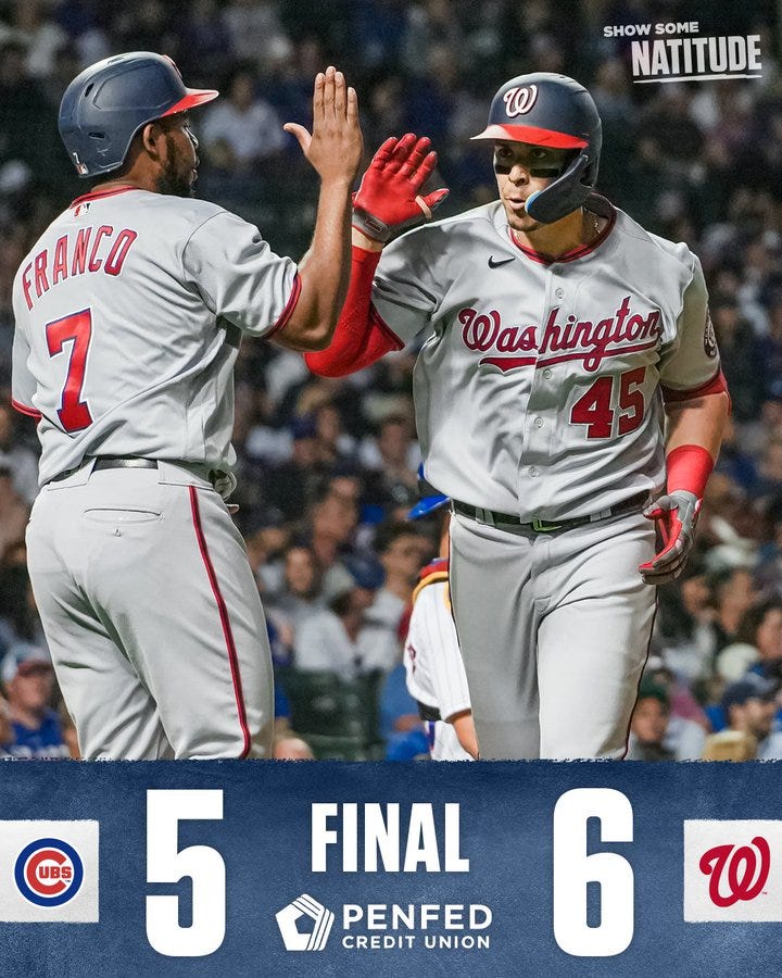
The Nationals have what the Athletics would with a little more effort. They’re pretty generic and they always list themselves second, which is bad, but at least the output is pretty stylish and they use logos instead of abbreviations.

They also deserve some praise for having three different, equally slick versions of this graphic: one for home wins, one for road wins, and one for City Connect wins. They don’t post any of these when they lose, of course.
21. Houston Astros (@Astros)

The Astros make most of the same mistakes the Cardinals do — they always list themselves first and they only post a graphic when they win — but they add team logos in addition to the abbreviations to increase brand recognition.

They’re also in the same camp as St. Louis in that their mess of a graphic is incredibly aesthetically pleasing. The space theme is unmistakably Houston’s and the City Connect version of their graphic drives that nail in even harder.
C-Tier: Could Be Worse
The teams in this tier still have clear graphical issues, but they’re not as big of dealbreakers as those in D-Tier. Most of these could be very good with a few small improvements.
20. Milwaukee Brewers (@Brewers)

This graphic has a lot of the same problems Atlanta’s does but is considerably less busy and easy to consume. The word “Final” is a little murky for no good reason and I can’t quite tell what’s going on in the background (the Wisconsin-shaped logo, I think?) because it doesn’t look like it’s layered correctly.

The Brewers only use a graphic when they win, but they do switch it up when they win in their City Connects, swapping out the navy for a blue sky and using a cleaner, simpler template with the Brew Crew wordmark replacing their primary logo. The advertisement being local is also a plus, but the red color is a little out of place.
19. Philadelphia Phillies (@Phillies)


Like the Red Sox, the Phillies mostly switch between two fairly simple templates seemingly at random. I don’t mind when teams have multiple templates, but I think there should at least be a method in choosing when to use what. The first one is almost impersonally bland and the second one would be just as bad if not for the Liberty Bell hiding in the bottom-right corner.

The Phillies also only use a graphic when they win, so what are the positives? For one, they’ve got a slick palette swap for when they wear their throwback powder blues, which isn’t very often, but I’m a sucker for that shade of blue. The reason they’re this high, though, is that all of their graphics include not only the final linescore, but also full-word labels for each of the columns, which is great information for new fans.
18. Minnesota Twins (@Twins)

I wasn’t expecting the Twins to be nearly middle of the pack when I started this project, but here they are. The main crime here, as I noted in the lede, is that this shade of blue they use just isn’t a Twins color, so it makes the aesthetic seem a little more…bootleg. Also, stop me if you’ve heard this before: the Twins only post a graphic when they win.

On the plus side, the way the information is presented is sleek and distinct, the exclamation points above the Twins’ score are a pretty fun gimmick, and there’s a neat symmetry between the home and road graphics, including a blue/red palette swap. Throw in the localized advertisement and there are definitely far worse graphics.
17. Detroit Tigers (@tigers)

Detroit’s whole scheme is a snoozefest that would look like it came from a national outlet if not for the “Win!” wordmark. The only reason I have it ranked this high is because the Tigers are brave enough to post the same graphic without that wordmark when they lose.

The Tigers should also be commended for the slick palette swap into navy and orange for road games. It looks a lot better than the home graphic.
16. San Francisco Giants (@SFGiants)

The Giants have a fairly mediocre template that doesn’t do much notably right or wrong. The color scheme and the slogan in the top left make it clear enough that it’s a Giants graphic. I’m not quite sure what’s going on in the bottom left (dirt? paint?) but I wish it was layered behind the photo because it’s a little distracting.

The background graphic on the right differs in home and road wins and, frankly, the road one looks amateurish and jarring. The Giants do not use a graphic when they lose.
15. Kansas City Royals (@Royals)


The Royals’ template is a little more intuitive than San Francisco’s but a little less distinct; I think it looks slightly better overall. The home and road graphics are identical but for a palette swap and both look exactly fine.

Where the Royals really shine is with their City Connect graphic, which takes the City of Fountains aesthetic and not only absorbs it, but also expands upon it. Tremendous work. Unfortunately, the Royals do not post a graphic when they lose. I promise we are running out of teams that do this.
14. Pittsburgh Pirates (@Pirates)

The Pirates’ graphics give you all of the most relevant information in just about the blandest way possible. Their black and yellow color scheme is distinct enough for them to get away with using no other personalization, but I wish they dug a little deeper. The logos are in grayscale, which is fine, but I’m really not a fan of how they get cut off on the edges of their respective boxes. It doesn’t look cool; it’s just distracting.

Posting a graphic with no image when the team loses is preferable to posting an image with no graphic, as some teams do. It’s also funny to me that their sponsor, a local law office, declined to be associated with losses. Personally, I prefer the graphic without the ad because their logo doesn’t even try to fit the color scheme.
13. Colorado Rockies (@Rockies)

The Rockies have a marginally better version of the Pirates’ set. Image in wins, no image in losses. More Rockies branding is present even though the color purple is distinct enough to carry the graphics on their own.

The logos are no longer grayscale but they’re still chopped off on the edges for no reason. There’s enough room to include the linescore, but they don’t, and I wish they would. Plus, seeing how empty a graphic looks without the date of the game makes me appreciate the graphics that include it a whole lot more.

The City Connect graphic leans into the revamped aesthetic well enough, but it’s otherwise pretty bland, and it unfortunately uses team abbreviations instead of logos. It also doesn’t use an image, even in wins, which strikes me as the wrong move.
12. Los Angeles Angels (@Angels)

The Angels have a very distinct brand that evokes both the Pacific Ocean and the bright lights of the city. Their win graphic always uses a highlight video instead of just a still image, a good and engaging strategy.

Their loss graphic is more low-key; like Pittsburgh, they don’t use any game media, but they go even further and replace the logos with team names. I’m normally not a big fan of an imbalance of information between the win and loss graphics, but I think the decision to only show the “next game” info on the loss graphic is smart. In wins, you want to celebrate the here and now, but in losses, you want to look toward brighter times ahead.

These are all compliments. So why is this graphic so low? Well, the City Connect graphic — which, admittedly, isn’t used very often — is a bit of a mess. For one, it always lists the Angels first despite City Connect jerseys almost universally being worn exclusively at home. If there was any time to build a template that always lists the Angels second, it’d be here, but they screwed it up. In addition, this graphic uses a logo to symbolize the Angels, but an abbreviation to symbolize their opponent, which I think was done so that another logo didn’t distract from the aesthetic, but it just doesn’t work.

I wanted to put this set a lot higher. The aesthetic, even for the broken City Connect graphics, is amazing; just look at that halo surfboard. In the end, though, I couldn’t forgive what I believe to be pretty major faux pas enough to place the Angels any higher than C-Tier.
B-Tier: Now We’re Getting Somewhere
The teams in this tier have overall good graphics that I just can’t fully endorse for one reason or another.
11. Baltimore Orioles (@Orioles)

I like the Orioles’ template a lot. It’s distinct and some effort was clearly put into its construction. Both versions — the orange/white for home games and the black/orange for road games — look phenomenal. Because the logo panels are so much wider than they are tall, the choice to chop the logos at the top and bottom looks more like a stylistic choice and less like an error. You can even see the name of the stadium on the right if you squint at it sideways, though I wish that text wasn’t so small.

The two downsides here: 1) the panel in the bottom right having “Win” layered twice on top of each other looks kinda dumb, and 2) the Orioles only post a graphic when they win.
10. Cincinnati Reds (@Reds)


Cincinnati has a great look, but they can’t decide what exactly they want that look to be. The Reds have three different templates for when they win, the usage of which correlates to nothing in particular. All of the graphics are good-to-great, but man…pick one (preferably the top one) and maybe jazz it up a little more.

In losses, the Reds have one template with three different color schemes (red, black, white), also correlating to nothing in particular. This is more acceptable than having three entirely distinct graphics, but I still wish they’d pick one and stick with it. Like the Angels, they intuitively only list the “next game” info on the loss graphic.
9. Texas Rangers (@Rangers)

The Rangers have a pretty simple style. The color scheme is distinctly Texas, the typeface evokes western imagery, and the hashtag at the bottom is a good tool to increase engagement. Most importantly, though, the Rangers get a lot of points from me for consistency; they use essentially the same graphic every day, win or lose.

If there’s one negative, I do wish the “TX” wasn’t red text on a blue background, as that’s inaccessible for some colorblind readers and is pretty hard to make out even if you’re not colorblind. A little more information than just the final score would also be nice, but is not a necessity.
8. New York Yankees (@Yankees)


The Yankees are the last team on this list that only posts a graphic when they win. They switch between two different templates, which I still don’t love, and the information displayed is also pretty barebones.
So why are they in my top 10? Simply put, I just love their style. I adore that both templates so clearly give off the “New York City” vibe. They’re also both GIFs, which adds more flair to the aesthetic by allowing a dynamic image to play on loop. I wish more teams did this; GIFs are extremely engaging and also just super fun.
7. Tampa Bay Rays (@RaysBaseball)


The visuals here are unmistakably Rays and they look great overall. The win graphic uses an image, the loss graphic doesn’t, and the palette is primarily blue for home games and yellow for road games.


On the downside, the loss graphic is a little too pared down for my liking. The logos for both wins and losses are chopped, but it’s especially egregious in the latter case because…look how much room they have. Finally, the Budweiser ad in the top left doesn’t match the vibe at all and the graphic is worse for it.
6. Seattle Mariners (@Mariners)


I don’t quite understand the stencil aesthetic for the Mariners but at least it’s unique. And it’s basically the same graphic win or lose, which is always a plus. Extra points for the nice palette swap when the Mariners wear their blue and gold alts.

My two gripes here are 1) the logos are chopped off at the top and bottom for no apparent reason, and 2) the information at the bottom is just a little understated. I think you fix both of these problems by expanding the bottom bar a couple dozen pixels vertically.
5. Arizona Diamondbacks (@Dbacks)

Arizona has another pretty low-key style that is very Diamondbacks and also very aesthetically pleasing. The image they use is sometimes a GIF, which is great; I wish they did it more often. No chopped-off logos, clear text…just a great graphic.

My only true qualm is that they have three different versions of it (red, black, and gold). In my opinion, the red version is the best and most distinct, and if they stuck with it on its own, they’d be in the A-Tier.

All of this without even mentioning the City Connect graphic, which brings the Serpientes look to another level. Overall, great work.
A-Tier: Home Run
The teams in this tier have excellent graphics. I wouldn’t change much of anything about any of them, and the things I would change are minor tweaks to suit my personal preferences.
4. Cleveland Guardians (@CleGuardians)

Say what you want about this franchise’s new name, but art deco looks great on Cleveland and this graphic is no exception. The Guardians use the same graphic for every game, win or lose, and sometimes they’ll also put a player stat in the top-right corner, which I think is a nice touch. I’ve never seen any state advertise itself as much as Ohio, but even that ad looks good here.
Maybe the bottom has enough space to include a little more information than just the final score. Maybe the template should say “Guardians win” in wins and “Final” in losses, as appears to be the standard elsewhere. But maybe we don’t actually need either of those tweaks because this graphic looks amazing as-is.
3. Chicago White Sox (@whitesox)

The White Sox found a way to make black and white look colorful. The Old English typeface, the great uses of gradients and shading, and the neat little patterns surrounding the image all make for a classic graphic that still neatly displays the relevant information.

Chicago uses a different graphic for losses than for wins, but both prominently feature an image and both look excellent.

They switch it up when they win in their City Connects, adding a neat brick wall background, using a cool graffiti typeface, and inserting the “Chi” and “Southside” wordmarks to spiff it all up.
2. Miami Marlins (@Marlins)

Aesthetics have always been important to the Marlins brand, and these graphics put that on display perfectly. This is slick, it’s bright, it’s gaudy. It’s Miami! (It’s also sometimes a GIF.) It has a whole ton of information without looking too busy, with the loss graphic also including the linescore, helping it look more intriguing without using a game image.

The crisp design work extends to the City Connect graphics, which display all of the same information in a more era-appropriate style with just as much pizzazz.

The Budweiser advertisement only appears in wins, but it’s so well-hidden on the regular graphic that it’s barely noticeable, and the color blends into the design on the City Connect graphic. Still…it’s there.

If I have one true complaint, it’s that the red numbers on a blue background don’t look the greatest on the City Connect win graphic, but the Marlins don’t wear these jerseys very often and they win in them even less, so this is rarely ever an issue.
1. San Diego Padres (@Padres)

The Padres style does everything right. Perfect use of team colors and logos, distinct typefacing, information shown consistently (and consistently well).

The graphic looks nearly identical in wins and losses, which is good, because both look awesome.

They even killed it with the City Connect look, pretty much reimagining their entire style within the constraints of the same template. This isn’t just a home run; it’s a grand slam. This graphic plays in Slam Diego.

The cherry on top? They commemorate big wins with a special graphic that looks even better than the original.

This is the definition of fresh. It’s impeccable. If I was designing final score graphics, this is the foundation I’d build on.
Final Notes
So there you have it: the Padres finally won something and the Dodgers finally finished last. Do you agree? Disagree? Think I have the worst taste in the history of Earth? Let me know! Until then, let’s all hope we’re seeing more of our team’s win graphics in the near future.