As MLS has begun, I have returned to dump on America’s most focus-tested league regarding every team’s branding choices!
Mostly, I’m gonna be looking at the name of each team, their colors, their crest, and their 2023 kits. And this time, we don't have any rules to follow because, for the most part, all of these out-of-touch “clubs” have something intrinsically wrong with how they present themselves to me, the most important person, not the local fans who go to the games.
We’re gonna go slowly here because I’m a busy person. Starting in the Eastern Conference, I’m gonna go in alphabetical order throughout both conferences, reviewing a few teams at a time until I get to all 29.
Let’s get started.
Atlanta United FC
Name
Unfortunately, Atlanta United is first. They will bear the brunt of my distaste for ripping off European names while lacking (checks notes) all of the histories behind them.
You have united nothing, and you have no history to justify the use of “United”; you just thought “OMG SO COOOL MANCHESTER UNITED” and daftly thought anyone globally would give two seconds to a soccer franchise in a city known for being a Delta hub and for its abundant strip clubs.
News flash for you and the rest of the MLS: nobody cares about your shallow attempts to rip off European club naming conventions to try and legitimize your existence. Grow up, it's embarrassing.
Crest and Colors
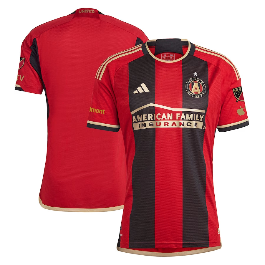
All that said, you have nice colors that match the existing sports culture in the city. It even captures those weirdos you hear barking at children in Athens, so well done!
Your crest is about as inoffensive as you can get, a lovely little roundel that isn't too busy and hasn't devolved into absurd levels of minimalism employed by some newer rebrands.
2023 Kit
Continuing the theme of bland yet respectable: your 2023 kits! Wow, they're really there!
Charlotte FC
Name
Fuck. You.
Everything about you is abhorrent to creativity. Nothing about you doesn't reek of David Tepper’s mandate of “be as boring as possible”. Not only is there another professional team in the metro with a better logo, name, and colors but you also teased the entirety of the area with better names from the outset.
For those who aren't familiar, here were the finalists in this team’s naming process:
Charlotte FC
Charlotte Crown FC
Charlotte Fortune FC
Charlotte Monarchs FC
Charlotte Athletic FC
Charlotte Town FC
Carolina Gliders FC
All Carolina FC
Yeah, I'm not sure how the hell Charlotte FC won. My god it's infuriating. If God were real he’d smiter this franchise from existence. I know what I’ll be praying for at Charlotte’s local Elevation Church.
Crest and Colors
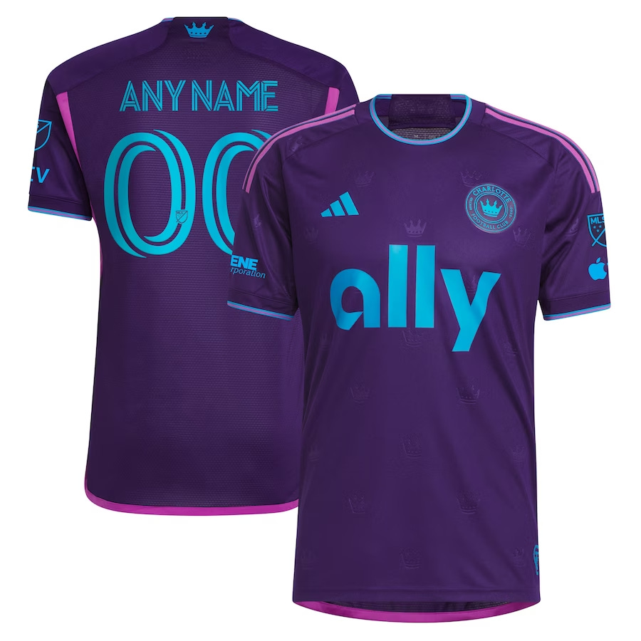
Your colors are a boring Panthers rip-off, cementing the accusation that you only exist as amusement for Tepper’s ego.
Your logo is yet another roundel for the league and it has the wrong crown in the middle. Imagine the HORROR of maybe paying a small bit to license the city’s official crown logo, or even designing something similar to it style-wise. You know, like the other soccer team in the metro. Smile.png.
2023 Kit
You released a new kit this year that is interesting, to say the least, and while it doesn't land for me, at all — no seriously, I think it's hideous; god it's ugly — it’s at least a twist, I suppose. You look like Trix Raspberry Rainbow, only I wouldn't trust someone who purchases this with kids.
Chicago Fire FC
Name
The name is an obvious reference to the Great Chicago Fire, which is a bit strange that you're named after a tragedy that hit the city. The only issue now is that the average person today will think of NBC’s Chicago Fire instead of the club that is hell-bent on reminding the city about tragedy every time they step on the pitch to “play” soccer.
All jokes aside, Chicago is already in the top half of the league on branding simply by having a unique identifier that is tied to the history of the city and not some vague approximation made after the fact to justify a totally-not-stolen name from Europe.
Crest and Colors
Weird that I’m about to wax poetic about an MLS rebrand, yet here we are. AHEM! The Fire were recipients of a small miracle by ditching a previous abortion of a design, and more importantly, the replacement was of a quality that most could only hope for.
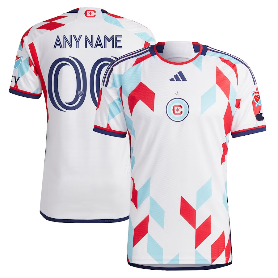
The Fire has also joined the roundel crest gravy train (we're at 3/3 right now; I promise there are other shapes). Thankfully, this new crest has managed to incorporate iconography from the Flag of Chicago in noticeable positive ways. The red six-pointed star is directly from the flag of the city along with the light blue stripes being used as the inner circle that has thinned strategically to emulate a firefighter’s badge, a nice throwback to the original crest coupled with the darker blue outer circle tying the new and old portions of the brand together succinctly.
God, imagine using the correct symbolism from your city, David Tepper could never.
2023 Kit
Your new kit is interesting. It reminds me of the Croatian national team’s kit at the World Cup.
The front of the kit is strange being so barren. Motorola has apparently pissed off and you haven’t gotten some new sugar daddy to ruin your kits yet, but instead of using this gift afforded to you, you’ve decided to design or use a template that is begging to be filled in.
Despite this massive, gaping, corporate begging, it does look nice. The colors mesh well and the geometric pattern is a fun yet simple design. You can just tell it’s begging for the corporate money shot right on the chest. It’ll even let you film it.
CF Montréal
Name
This feels like kicking an injured puppy—the fans, not the knobs running the team.
Nothing I can say here will be more impactful than just letting the English-speaking Americans who salivate over faux European names know what’s happened since this club switched from their original name, Montréal Impact, in 2021. There’ve been protests at the stadium and a cold war between supporters and ownership, the Ultras supporters group has been banned from the stadium, and the fanbase has started a petition to revert back to the original name.
To borrow from Le Journal de Montréal and their interview with the Ultras:
“It's a bit ridiculous to try to appropriate a term that is more or less used as 'foot'. We came to erase the history that is attached to the Impact as well as the identity to which people are attached.
“We are aware that, in a club, the logo, the jersey, and the colors are destined to evolve. It is more the discourse of identity change that poses a problem for us.”
Clearly, this butchering of Impact’s history doesn’t sit well with locals and I fully support their desire to revert back to Impact.
Crest and Colors
Gone are the (thankfully brief) days of the snowflake roundel that also had more than a passing resemblance to a puckered team owner—sorry, I meant asshole.
In the team owner’s place, we have another roundel that seems a bit confused as to what it wants to be. It incorporates the old badge with a literal shield design in the middle of the roundel, and it contains a classic fleur-de-lys, which helps you know this team is French and deserves your ire. (Joking, joking, sort of.)
Montréal has also made blue the prominent color over black in the old crest and branding. Hopefully, we will see what their kits look like next year because, like every good Frenchman, they must have gone on strike and didn’t cook up any new kits for this year.
Next up: Columbus, D.C., Cincinnati, Miami


