We Have Thoughts on the Minnesota Twins Rebrand
Our favorite baseball team completely rebuilt their aesthetic. What do we think?
The Minnesota Twins haven’t been the kind of team to undergo radical, brand-altering changes. The TC logo hasn't changed since the team moved to Minnesota from Washington prior to the 1961 MLB season, nor has the basic idea of the Minnie and Paul logo that now shadows above center field at Target Field. The “Twins'' wordmark has been the same since 1987, with use of the old wordmark scattered about in throwback uniforms and classic alternatives. They have had the same basic uniform template and colors — red, white, and navy — since the Washington days, with the Twins only adding a new color, Kasota gold, in 2015 and phasing out their pinstripe look that same year.
In all, the Twins never fell victim to branding trends of the ‘90s (black for black’s sake), ‘00s (futurism i.e. the Blue Jays), and ‘10s (alternatives galore).1 So today is a new day in Twins Territory: the Twins have followed a trend of recent rebrands by teams that try to capture iconic looks of the past with the modern stylings of today, and have unveiled new logos and uniforms at the Mall of America that’ll be used in the 2023 season and beyond.
Your local Minnesota Twins fans maddy!, David, and Eli2 have gathered at the old fictional watering hole (or pretend we’re at Brit’s Pub in Minneapolis) to discuss what we think of the new look Minnesota Twins.
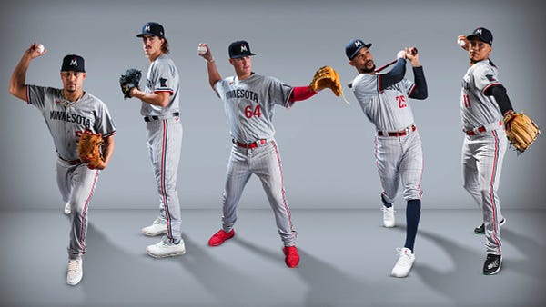
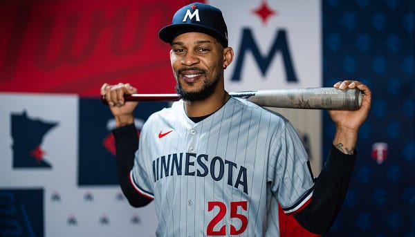
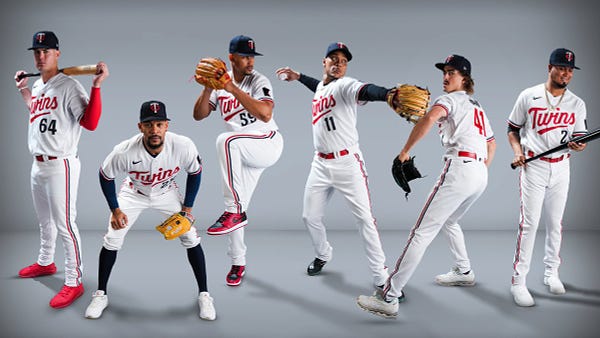
The road pinstripes
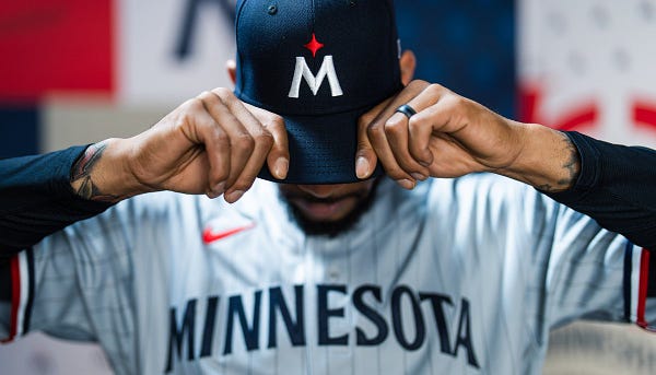
Maddy: This is fine. The blue wordmark I think is helping a lot.
Eli: I actually like the pinstripes a lot, which is weird because I was really hoping and praying they wouldn’t bring back pinstripes leading up to this release. I think I just didn’t want them on the home whites.
David: I’m not mad!
Maddy: Seeing it here, it’s growing on me. It’s the blue Minnesota wordmark. It’s doing wonders.
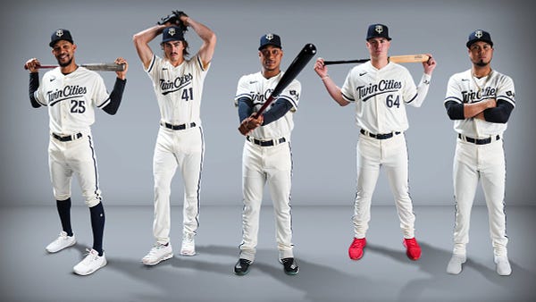
The cream Twin Cities alt
Maddy: This might be my favorite Twins jersey ever. Embracing the “Twin” in the team name? Check. Clean as hell? Check. The crossed flags Minneapolis and St. Paul logo? Honestly love it.
Eli: I love the piping on all of these jerseys. Doesn’t overdo it on the top but adds flair to otherwise dull pants.
David: I am very much hoping they’ll put the crossed flags on a hat because they will take all of my money if they do so.
Maddy: The cream TC logo, ooooooh.
Eli: They said this was the first time a pro sports team in the Twin Cities has ever worn “Twin Cities” and I’m honestly stunned it took this long.
Maddy: The Timberwolves are too busy having kindergarten art projects on their jersey.
David: Lmao. The Wolves put out a hat that had THE CITIES on it with an outline of Minneapolis and St. Paul. Extremely dope but not official.
Preston: Something just occurred to me: is this the only uni in the majors that’s just navy on white (no pinstripes)?
Eli: I can’t think of another current one off the top of my head.
Preston: The Padres had some before their rebrand, I believe, but that’s all I can think of. Really surprising because it’s a fantastic minimalist palette done right, as the Twins have done it here.
The roundel logo
David: hohohoohohohohohohohohohohohohoh
Eli: Did we really have to do another roundel? I guess if you’re inspired by the past…
Maddy: I guess the Twins aren’t a club anymore!
David: I’m hoping the roundel features less. I think every team should have one because I love them as a concept but I do appreciate when it doesn’t become the centre of our identity.
Maddy: I mean, branding-wise, TC has been the main logo.
David: Yeah. I think I like the M-star the most, then the TC, then the roundel. But I really hope we prioritize the crossed flags in some aspect.
The navy alts

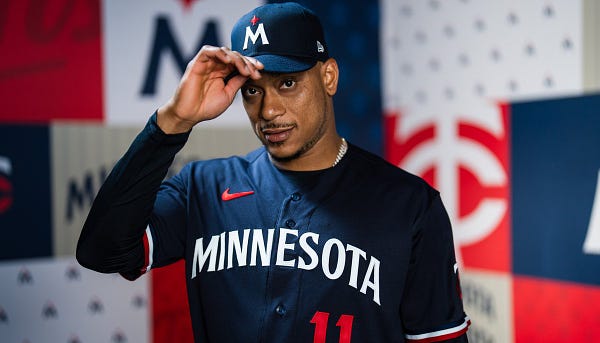
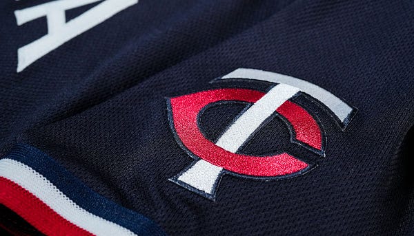
Maddy: Aaaaaaa! It’s good!
David: Combining this with the pinstripe pants is my least favorite combo so far, I think, but it’s still not bad.
Eli: This looks so slick without all the extra colors muddying it up. I liked the gold a lot, but it just didn’t work on the navy background.
The home whites
Maddy: I think this is running a close second to the Twin Cities alts. It’s just very clean. I was honestly worried about the lack of outline on the Twins wordmark but it works so well here.
David: I was too.
Maddy: And in hat form…the TC logo looks normal, lol. The red Twins wordmark looks a lot better than blue, in my opinion.
David: Strong agree on that. Especially sitting on white.
Eli: This looks like an NHL-style reverse retro branding except it’s permanent. And it’s perfect.
David: Now we just gotta get the Wild to modernize.
Miscellaneous rambling
Preston: The font work on this rebrand is my favorite part, I think.
Maddy: The font is wonderful! All of them, really.
David: STRONG AGREE! I need to know what typefaces they used.
Preston: It manages to feel classic and clean and uniquely Minnesota, which is a very difficult combination to strike.
Maddy: Exactly how I feel. It feels “Minnesota” but still classic.
Preston: Shoutout to the number font especially.
Maddy: Hate to mention the Timberwolves again but their rebrand felt like copying the ideas of other teams to look “modern” and doesn’t feel as connected to Minnesota.
David: Yeah. I mean, they pulled the color scheme straight off a Seahawks jersey. I don’t hate the rebrand but I stand by my assertion that it doesn’t do enough to hark to the place it comes from.
Eli: They literally just copied SB Nation’s Canis Hoopus. Everyone saw it at the time.
David: A jersey should represent the city/state/area first and foremost. Nothing about what the Wolves have feels “Minnesota”. MNUFC does it. The Wild have a dated look but it gets the job done. The Vikings certainly have managed.
Eli: I will continue to gush about the piping down the side of the pants. I think it completes the look. The previous era jerseys, it was just kinda there. The gold got too muddled in with the red and navy. This looks so crisp in comparison.
Maddy: This Twins rebrand really does capture the idea of harking back to classic stylings (the piping on the arms and pants) while still finding ways to be modern (the M-star logo) and making it all work to feel like this is the Minnesota MLB team (the fonts doing a wonderful job on this end).
David: Completely agree.
Maddy: The Twin Cities jersey withstanding from my last point. I’m just really happy we’re getting something like that. Like, yes: the old M is great and wonderful but it would not fit in at all with everything else this rebrand is doing. The M-star is good!
Eli: I’m also pleasantly surprised at how few colors this is using. I said I liked Kasota gold, but it’s nice to see the team finally just commit to navy and white as the primary identity. No awful batting practice red alts — red is Cleveland’s color; they can have it — and no extra colors just for the sake of it. Unfortunately no baby blues either, but I bet we’ll get back there soon.
Maddy: And the little Minnesota logo on the sleeve with the star over the Twin Cities!! Maddy is happy. Also! At least for now, no sponsorship.
Eli: That’d be such a bad PR move if they announced a sponsor during the reveal lmao. Imagine.
Maddy: As much as I don’t care for jersey ads, a Target logo on a Twins jersey would be funny.
Eli: It’d fit the color scheme!
Final thoughts
Maddy: This is a solid, like, 8/10 rebrand. This is very well done. Up there with the Padres. Also, the rumor of the City Connect jersey being shown off dies. More than likely waits another year.
Eli: I agree. I’ll give it that same score: 8/10. The M-star logo feels simultaneously like a bold statement and an obvious one. The Vikings are now the only pro sports team in the state not to feature the North Star in their branding.
David: I think I’m giving it a 9/10. Point off for the baby blues being gone and I’m not 100% on the new TC logo but the rest is absolutely phenomenal.
Eli: I can’t wait to see these in game action. How many days until Spring Training?3
Maddy: When MLB the Show 23 drops and I just play with the Twins only so I can see the unis…
David: Oh I am so doing a Twins career mode. Normally I just let the winds take me wherever. NOT THIS TIME.
Preston: With respect to the new TC, it seems like they were trying to bring it in line with the serif font used elsewhere. Not sure if it was worth it or not.
Eli: I sure hope they don’t get rid of Minnie and Paul in center field. That’s the most iconic part of Target Field to me.
Maddy: There will be a new scoreboard at least. (I don’t think anyone knows what it’ll look like.) I actually do wonder what they’ll do with Minnie and Paul because that current sign has the old wordmark.
David: If they axe them I’m gonna be so sad. I also hope they keep the retro look of the digital scoreboard; I liked that aspect a lot.
Eli: Maybe they’re waiting to reveal a Minnie and Paul with the new wordmark? (Please?)
David: Oh, that would make me so happy. I would also love to see Saints and Millers throwbacks eventually for the minor league team, but that’s a different jam entirely.
Overall reviews
Maddy
Pros
The home uniform is extremely clean and captures the retro modern ideals teams are aiming for.
The navy alt is a wonderful evolution of their previous navy alts.
The Twin Cities cream jersey itself
The TC is still solid; it’s just gonna take a while to get used to.
The M-star is a nice touch and I love to see North Star iconography.
The jerseys look amazing with high socks (the best look).
The fonts and jerseys feel Minnesotan and that’s the biggest win.
Cons
The road uniform is meh and I’ll probably continue seeing it this way.
The M in the M-star logo looks a little weird but I still like it.
The loss of the Minnie and Paul logo is kinda sad but the crossed flags logo is honestly wonderful.
No baby blue uniforms
David
Pros
The home uniform is exactly what I wanted: minimalist without being sparse. It feels Minnesotan enough.
The navy alt is absurdly clean; great design all over that one.
Literally everything about the Twin Cities alt
The grey pinstripe look, while not my favorite, is about as well done as I think we can expect it to be.
The M-star logo is an awesome homage. It feels modern without looking like Brandiose got their hands on our shit.
The fonts. The FONTS. THE FONTS.
Cohesive brand identity that adds by subtracting. It feels thoroughly representative of the Twins and of Minnesota.
Cons
I don’t love the TC logo. Something just feels off.
No baby blue uniforms
No Minnie and Paul logo (though this is somewhat offset by the crossed flags)
Eli
Pros
The home whites are like an NHL Reverse Retro jersey done perfectly.
The Twin Cities cream alts are just a home run; the all-cream TC logo looks so clean on the hat.
Reinstituting pinstripes only on the road greys is a great way to tip your cap to the past without looking like Yankees wannabes.
The navy alts look so clean without all of the extra colors muddying them up.
Sticking to a very simple color palette also means there’s no red jersey; huzzah!
Aside from the new TC, the new logos are just awesome: especially the M-star and the crossed flags.
The piping down the side of the pants looks so much better now and completes the aesthetic for me; it’s so crisp on all the uniforms.
The fonts look so slick: the script, the serif, all of it.
The team will win the AL Central the first year they play in these jerseys.
Cons
The new TC logo just doesn’t look right after so many years of the previous one; I don’t know how long it’ll take me to warm up to it, but it’s not immediate.
There’s no baby blue uniform but I get the feeling they’ll probably wear them as a throwback every now and then; you don’t just get rid of those…right?
The minimalism doesn’t really work for me on the roundel logo but the team hasn’t extensively used the roundel in branding for ages and I don’t think they’ll resume now.
Minnie? Paul? Where are you? Are you still in center field?
The serif font reminds me a little too much of Seattle’s but I can’t actually tell if that’s a bad thing; I can say it doesn’t necessarily feel as “Minnesota” to me as it does to the others.
The red alternate jerseys the Twins used near the end of the ‘10s might fall under this trend.
The Twins’ Grapefruit League opener is on Saturday, February 25. That’s 99 days away.


